Lighting wood interiors: colour, contrast and useful layers
Lighting wood interiors: colour, contrast and useful layers. A clear working guide to colour temperature, colour rendering, and layered light on timber.
- Published: 13 September 2026
- 841 words
- 4 min read
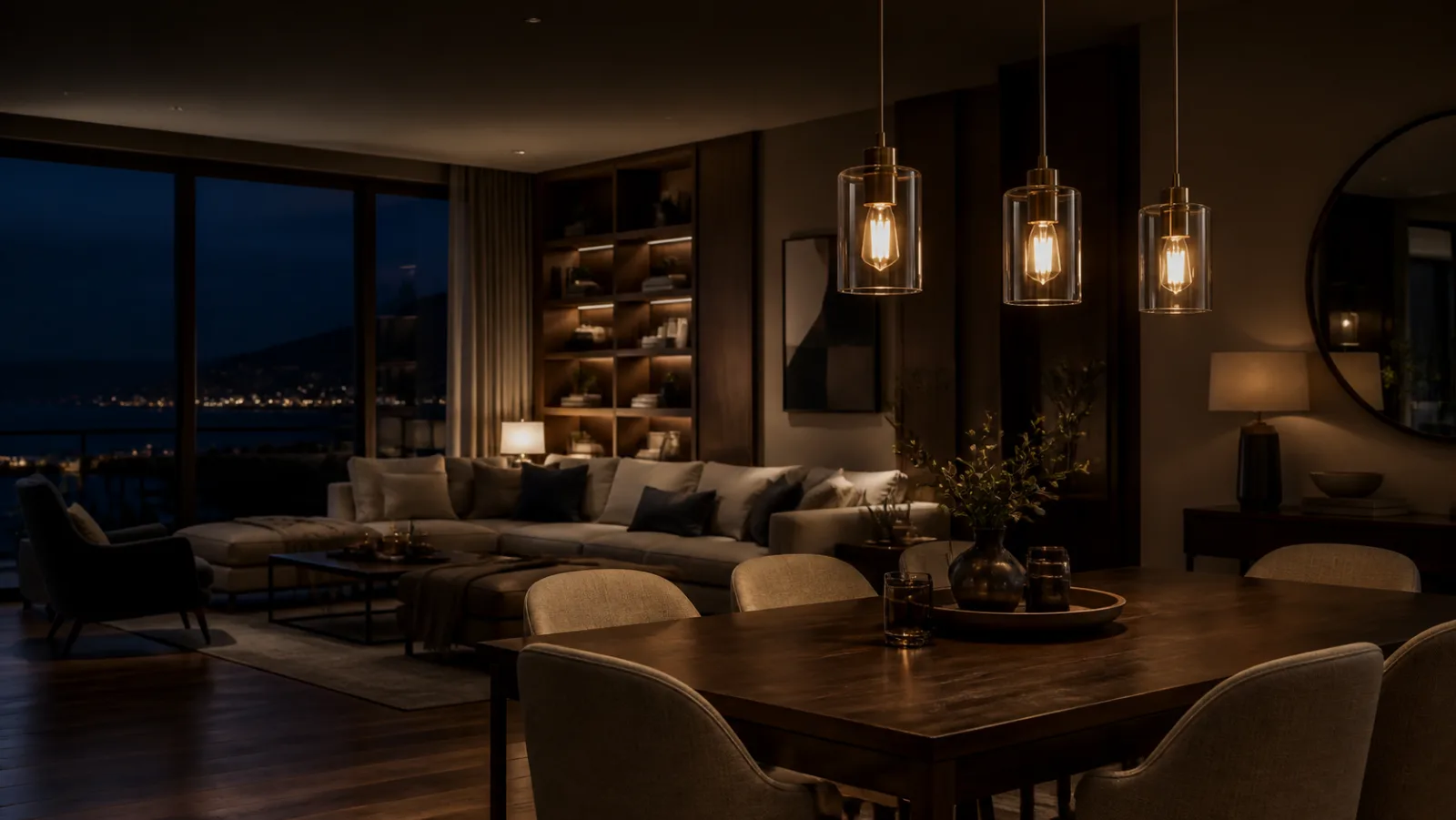
Wood answers light more honestly than paint or plaster, which is why a room of timber can look rich under one lamp and tired under another. Three decisions carry the result: colour temperature, which decides whether a surface reads warm or grey; colour rendering, which decides whether grain keeps its depth; and contrast, which decides whether wood reads as texture or as a flat brown field. The material half of that pairing, species, construction and finishes, is catalogued board by board in Nodo & Dimora's notebook on wood and furniture, an Italian editorial project that reads every surface through what it is made of. What follows is the lighting half.
Which colour temperature flatters timber?
Most domestic woods carry red and yellow pigments, and a lamp either feeds them or starves them. A practical starting point is the warm end of the range: at 2700 K the warm part of the spectrum keeps walnut, cherry and oiled oak looking like themselves, while 3000 K is often a better first try on paler species such as maple, ash and birch. Cooler lamps are still worth an actual test rather than a rule, because temperature alone does not settle the result — rendering quality and contrast do as much. The room-by-room version of that kelvin decision is worked through in our guide to warm and cool white; the short version for wood is to start warm, then judge the boards in front of you.
Why does colour rendering decide the grain?
Two bulbs at the same temperature can show the same tabletop differently, and the gap is colour rendering. The red index, R9, is where ordinary LEDs are weakest and where cherry, mahogany and walnut heartwood carry most of their colour. A CRI 80 lamp with a poor R9 makes a red-toned sideboard read muddy and flat; a CRI 90 lamp with a strong R9 keeps the figure visible at the same brightness. It is the same honesty test we apply to prints and frames in the guide to lighting wall art: where the manufacturer publishes one, check the R9 value or the TM-30 report in the datasheet rather than the kelvin number alone. The method exists precisely because two lamps at one temperature can render the same colours differently, as the US Department of Energy's TM-30 questions and answers set out.
Where do contrast and shadow earn their keep?
Uniform ceiling light is the enemy of grain. Veneer and figure only read when one direction of light is stronger than the rest, so the room wants a deliberate bright-to-dim ratio rather than an even wash. A low pendant pool over a wooden table gives the top its own stage; a grazing source raked across a slatted sideboard or open shelving shows the profile of each board. One accent per wooden piece is enough, and the layering that separates task, ambient and accent sources is the same structure we use in the layered lighting guide. Aim accent light across the surface, not straight down onto it, or the eye meets glare off the finish instead of grain.
How much light can a finish take?
Light damage on wood is cumulative and cannot be polished back out: finishes darken or yellow, and some species bleach while others deepen. The largest load is usually daylight rather than the lamp, so a top that sits in direct sun deserves attention before the bulb beside it does. The conservation levels museums work from, roughly 50 lux for the most sensitive surfaces with ultraviolet filtered out, are set out in the Canadian Conservation Institute's note on light as an agent of deterioration. At home the practical answer is a sheer curtain on the bright hours, a dimmer on the accent, and LEDs that add almost no ultraviolet of their own.
Timber in a clock case is asked for more than a floor or a table is: warm light on an antique clock keeps the output low enough that a finish and a dial survive an evening in the same room.
The screen wall is usually part of the same timber room: the article on living room light around a screen keeps the grain readable once the set is on.
Judge the pairing after dark
Evaluate a wood interior from the seat the room is actually used from, and only after sunset. Check that the tabletop reads brighter than the room behind it without a reflected bulb in the finish, that shelving shows depth rather than a single lit plane, and that the warmest wood in the room still looks warm under the chosen lamp. Then dim every source once and look again: if the grain still reads and the room stays comfortable, the scheme has room to breathe; if it only works at full power, adjust it before buying anything else.
Light the wood, not the room, and let the grain carry the contrast.
Common mistakes
- Running a cool white ceiling grid over walnut and wondering why the room went grey.
- Aiming a downlight straight onto a glossy tabletop so the eye meets the bulb instead of the grain.
- Buying lamps before the furniture plan is fixed, then lighting where the sideboard used to be.
- Arguing about wattage while unfiltered afternoon sun does the real damage to the finish.
Wood indoors and wood outdoors raise different problems, and the same fixture rarely solves both. Inside, a shaded lamp keeps glare off the grain; outside, the surface sits against weather, dark gaps, and open sky. The question of how to place fixtures so a timber deck and a ventilated facade read evenly after dark, without hot spots or light spilling behind the cladding, is answered in this guide to warm light on exterior wood, which covers placement, glare control, and the cavity behind the boards.