Light wall art and pictures without glare
Light wall art and pictures without glare. A clear working guide to accent angle, colour rendering, and safe brightness.
- Published: 11 September 2026
- 507 words
- 3 min read
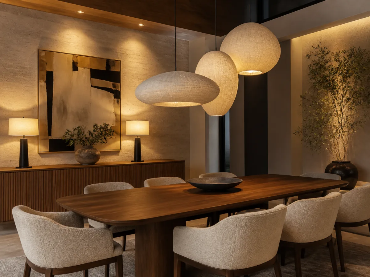
A picture is lit well when the wall around it stays quieter than the image. In practice that means one small accent source per piece or per group, aimed at roughly thirty degrees from vertical so the beam clears the frame instead of bouncing into the viewer's eyes. A warm white LED with honest colour rendering covers most rooms. The decisions that come before any lamp, the right size for the wall, the hanging height and the frame, are measured wall by wall in the Tableaux Décou guides to wall art, a French magazine that settles those questions before a single hole is drilled.
Where should the accent light sit?
Start from the viewer, not from the ceiling. Stand where the picture is meant to be seen, then place the source so the beam meets the image near its centre and the frame casts no visible shadow. Thirty degrees from vertical is the usual working angle: steep enough to dodge reflections on glass, shallow enough to light the whole surface. For a gallery wall, one wider wash or a short track with two heads reads calmer than a spot per frame.
Which bulb renders colours honestly?
Colour rendering decides whether the picture looks like itself. A high CRI LED, 90 or above with a strong red index, keeps warm pigments alive; a cool lamp at 4000 K flattens ochres and skin tones against most domestic walls. Stay between 2700 and 3000 K so the accent agrees with the rest of the room. Brightness stays modest: a small spot of 200 to 400 lumens is enough for a single frame at reading distance.
The same honesty test reaches beyond the frame: a weak red index flattens a walnut tabletop the way it flattens a warm print, and the kelvin, rendering and contrast choices for timber are gathered in the wood-interior lighting guide.
How much light can a picture take?
Light damage is cumulative and irreversible, so the aim is enough light to read the image, no more. Works on paper, watercolours and textiles are the sensitive cases and sit comfortably near 50 lux; oil and acrylic tolerate closer to 150 or 200. LEDs add almost no ultraviolet, which makes daylight through a nearby window the larger threat. The conservation notes in the Conserve O Gram series of the US National Park Service give the working levels museums apply to their own collections.
The test that protects a picture also protects the objects standing under it: LED bulbs for antique lamps covers the heat and the spectrum that brass, old glass and varnish can live with.
A television asks for the same seated check: the guide to cutting screen glare runs the same reflection hunt on the panel, where the offending lamp is moved rather than the whole room darkened.
Judge the result at night
Evaluate the accent after dark, from the seat where the picture is actually viewed, not standing at the wall. Check that no reflection crosses the image at sitting eye height, that the frame edge stays out of shadow, and that the lit picture reads brighter than its surroundings without glaring. Dim the source once before accepting it: a picture light that still works at seventy percent output will age the image more slowly.
Light the picture, not the wall, and let the frame cast no shadow the eye can find.
Common mistakes
- Aiming a spot straight down so only the top edge of the frame glows.
- Choosing a cool white bulb that drains warm pigments of their depth.
- Wiring the accent before the final hanging height is decided.
- Leaving full daylight on a watercolour while arguing about lamp wattage.
A related problem appears when the reflective surface is a mirror rather than a framed print. A mirror throws light back at the viewer, so a lamp placed in front of it doubles the glare instead of reducing it. The fix is to move the source to one side and let the glass catch the beam at an angle. A guide on side light on a mirror explains how placement, color temperature and candle-style fixtures keep facets and engraving legible without washing out the silvering.
Glare on a wall often starts at the window, not at the frame. A room with wide glass and narrow frames can throw a bright patch that shifts across the day, so a picture that looks fine at noon may wash out by late afternoon. The guide on daylight and glare on a wall explains how glass area, frame width, coatings and ventilation alter that light, which helps when deciding where to hang art and how to aim a fixture.